

New! Watch a video overview of SurveyPro!
Data-driven decision making is critical to all organizations. You need the ability to collect pertinent data, segment the data for comparative analysis, and produce easy-to-read charts and graphs that visually convey the results of your analysis. The KinderCharts Survey Reporting System is the ideal data analysis tool for Head Start and Early Head Start organizations.
The KinderCharts Survey Reporting System empowers you to quickly and easily create agency-defined surveys to collect a variety of information for both your staff and your participating children and families. In addition, you can collect anonymous information for agency-defined areas, such as sites, classrooms, cities, ZIP Codes, and other areas of interest to you and your agency.
The process is easy. Simply...
Each Survey instrument you create in KinderCharts can have as many as five agency-defined attributes that can be used to segment the responses for comparative analysis. Examples of possible attributes are as follows:
SurveyPro allows you to use weighted answers with your Child, Family, and Staff survey instruments. SurveyPro not only scores the survey data entered, it also calculates gains and outcomes over time, using the scored results of the earliest and the latest Survey entered into KinderCharts over a user-specified time period. KinderCharts is the only system available that allows you to calculate gains and outcomes for your children, families, and staff over a multi-year time period.
Once the data is collected, the responses for each question can be analyzed and graphed. Comparative analysis can be performed by creating graphs that include:
This allows comparative graphs to be generated. For example, comparative graphs can be created for children whose attendance is 85% or better versus those whose attendance is < 85%, or for one-parent households versus two-parent households.
The labels you choose for each category are used in the reports and graphs to make the information more understandable to the viewer. Further, the Scoring Categories you define can be used as filters for the Gains reports, allowing you to analyze gains by Scoring Category. Through this feature, you can now isolate aggregated gains to show the gains realized by the neediest of your children and families. This eliminates the dilution effect caused by aggregating all of the child or family gains together into a single number.
By way of an example, suppose you have a Family Assessment with several Categories and several items being assessed under each Category. Further, let’s use a Weighted Answer Set for this assessment with the answers of:
Now let’s define Scoring Categories for this assessment with the following 5 categories for aggregated scores:
Let’s also define Gains Categories for this assessment with the following 4 categories for aggregated gains:
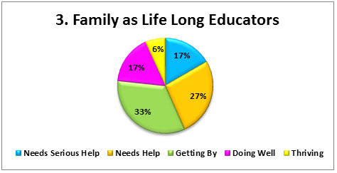
In viewing the graph for Category #3 of the assessment, as calculated by the aggregated Scoring Category Analysis report for the first assessment performed with the families, the scoring distribution could look like the following graph.

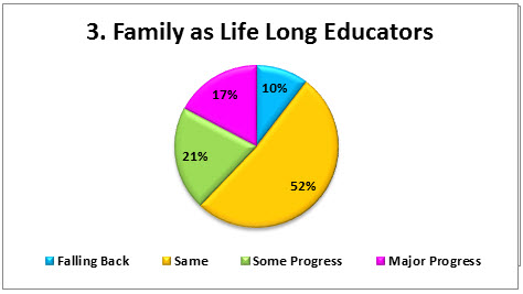
By the end of the year, the aggregated Gains Results could look like the graph below.

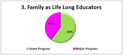
Filtering the Gains Results to look only at the families who scored in the Needs Serious Help Scoring Category, the Gains Results could look like the graph below.

Filtering Gains Results by Scoring Category more accurately represents the value your organization brings to the neediest of families. As shown in the example above, 60% of the neediest families achieved Some Progress and 40% achieved Major Progress. This is substantially better than reporting that only 21% made Some Progress and only 17% made Major Progress. Eliminating the dilution effect presents the value your agency brings to your families and community in a much more favorable and realistic manner.